top of page
ATNSC
ATNSC is an arts and healing space in Ohio. The organization came to Collective Power searching for a rebrand that felt reflective of their spirit and mission. The space holds a gallery as well as community space, and as such, we wanted to create a logo that positions ATNSC as a peer of contemporary galleries in major cities like New York while also representing how ATNSC aims to break the mold of what a gallery space can be and how it can promote community and healing.

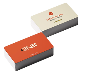
Working with another designer, we iterated on a few ideas and landed on a logo that was impactful and adaptable. The wide "N" at the center of the logo creates a sense of balance while also calling attention to the idea of "and," representing how the space can be a gallery and more. The organic circle cutout represents both breaking the mold and fitting into a community. The shape is not fully connected, as ATNSC aims to promote individual thought and acceptance while still providing an open space for all.


In order to help the client visualize the brand, we created some spec merch items. These items brought the brand to life. The client was able to envision the community of supporters and members feeling proud to represent ATNSC.


The visual identity was translated into a website, with many of the elements from the logo able to flexibly incorporate. From circular shapes, hand drawn elements, and elevated type and color pairings, the new website was significantly more visually engaging and allowed visitors to glean much more about the organization than before.
LEFT: AFTER, RIGHT: BEFORE
bottom of page